10 Things to keep in mind while designing your abandoned cart emails series
Author : Ashley Kolpak
10 things to keep in mind while designing your abandoned cart emails series
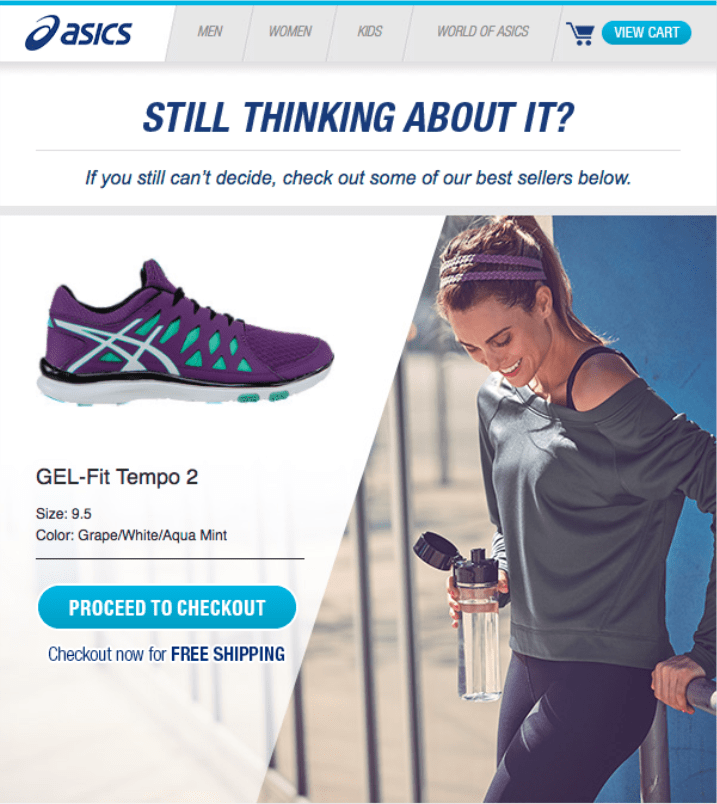
One of the unavoidable statistics in e-commerce marketing is that 75% of all online shopping cart visits will end in abandonment. On mobile devices, that number creeps even higher – circling above 85%. What’s a marketer to do in the face of such high drop-off rates? That’s where cart abandonment emails come in.
Cart abandonment uses tailored information to remind your customers to complete the purchase funnel. Sounds great, right? When executed properly, these communications can win back customers and strengthen relationships. When executed poorly, brands can alienate a customer for life.
Designing an abandoned cart email series | Here are 10 important things to keep in mind.
1. Set yourself up for success with compliance
GDPR can be a four-letter word when it comes to email marketing, but it doesn’t need to be. Staying educated on all of the latest email privacy policies all around the globe pays dividends in avoiding spam complaints at least and legal escalations at worst. Cart abandonment communications can live in that gray area between marketing and transactional emails, so making sure you are capturing the opt-in information you need from your customers is key. If you have a legal team, work with them to understand what legal considerations should be taken before launching.
The most effective cart abandonment emails are very specific, taking the customer right back to where they left off shopping on your site. This requires collecting certain data points from individual site visits. With increasing data breaches, customers are more and more aware of data privacy. Win over customers with solid privacy practice compliance and you’ll see the conversions.
2. Treat your customers with care
There’s a fine line between delivering the customer exactly what they want and giving them the feeling that someone is stalking them around the internet. In order to take care of your customer, make sure the purpose of your email is incredibly clear. Avoid misleading subject lines and make sure any information that is served back in a cart abandonment email is accurate. Show your customers some love with extra discounts, but be wary of overselling.
Walking the tightrope of effective abandoned cart campaigns can be tricky, but thoughtfully considering how all of your customers might receive it, from least to most engaged, is important to tackle early on in the process.

3. Grab attention with the right copy
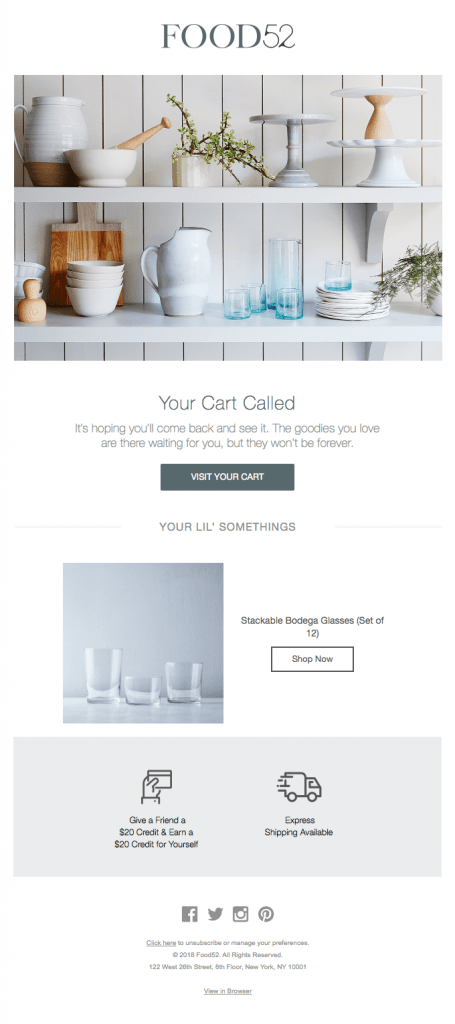
I bet if you took a look in your inbox right now, you’d find no fewer than 5 abandoned shopping cart emails. Think to yourself – which of these emails wins the day? For me, creative subject lines and playful copy stand out in a sea of pleas to make the purchase. Keeping your audience in mind, this is the time to pull out the ultimate attention-grabbing copy in your arsenal. “We saved your cart” is pretty standard, and is well understood with a variety of audiences. If you can be a bit more playful, give it a try. “Your Cart Called” from Food52 is a simple twist on the classic cart abandonment headline. Adding in that one small adjustment adds warmth and personality, further intriguing the customer about what they left behind.

4. Dazzle with personalization
It should come as no surprise that the star of cart abandonment show is the display of products that were sadly left behind. Using a mix of data and compelling imagery, this one email creates and entire brand experience just for them. There are certain email service providers and other development tools that use machine learning to predict what other items a customer might like. These recommendations can be very powerful, especially for retail e-commerce companies.
Returning to a common theme, with great data collection comes great responsibilities. If you can, interview a few users who have received cart abandonment communications and gauge their response to the amount of personalised information. Use these insights to iterate on your design.
5. Keep it simple with product information
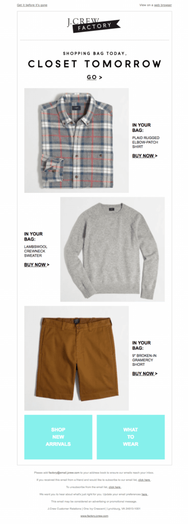
Keep your customers’ eyes on the prize. Some of my favorite cart abandonment emails are the most simple – large, clear images with explicit pricing details are helpful for jogging memory for browsing in the first place. If you are designing an email with large images, keep in mind how important alt text and other accessibility measures are for ensuring a great experience for everyone who opens the email. A cart abandonment is an extra chance to connect and renew the conversation with a customer. Increase your chance by keeping it as clear and direct as possible.
6. Sweeten the deal with a discount
Just one more time, think about your inbox again. Of all the emails sitting there, eagely awaiting to be read, how many of them have a discount? If they are the fruits of abandoning a shopping cart, I’d wager nearly 100%. As a marketer, using a discount is an effective tactic to close the sales funnel. These days, as customers, we’ve all nearly come to expect it. If you would rather not offer a discount as a lure back to the cart, finding what works best for you through a series of tests is a great route to take.
7. Determine the right cadence
No one wants to be bombarded with emails, especially emails from a product or service that hasn’t even been purchased. That’s where cadence comes in. Triggering an email shortly after abandonment is the obvious first step.
What comes next is the tricky part, part art and science of observing how metrics shake out. Is the next time to remind 24 hours, or 2 weeks later? What are the barriers to entry for purchasing your product or service? Is it an impulse buy or a CEO sign off? These are important questions to keep in mind when you are designing your cart abandonment emails.
8. Create an A/B testing plan
Test, test, test is often a marketer’s rallying cry, but with so many unknowns (you are sending emails to people who haven’t purchased yet, after all), determining that A/B plan will make room for continual iteration and improvement.
Work together with your team to source alternative subject line and copy ideas. Try out alternative cadences. Try out different cart layouts and descriptions. Enter into each test with a specific goal, and continue to tweak your cart abandonment creation into an irresistible part of your tool set.
9. Keep Key Metrics in mind
Trying to estimate how many orders will in before launching a full-scale cart abandonment campaign depends on factors that aren’t necessarily available until the campaign goes out. Understanding how much traffic your site gets versus how much it converts is a helpful way to set expectations. Setting specific goals (we are looking for 500 new orders a quarter, we are looking for less than 1 percent bounce rate) and evaluating them regularly is the best way to know if any campaign is worth it, including cart abandonment. If you are seeing metrics below your expectations, review the A/B test log. Reach out to customers who have not opened or unsubscribed. It comes full circle — reach out to them with care and listen to feedback. With clear goals at the outset, understanding the results becomes that much easier.
10. Don’t forget to follow up!
Through cart abandonment, you may find yourself with a whole new list of opted-in customers who you know are interested in your product or service, but aren’t ready to commit. Extend the flow with a cart abandonment drip campaign that naturally extends from the initial “Cart Abandonment” flow. Create separate emails for users that clicked but didn’t buy, who opened but didn’t click, for those who didn’t open at all.
This could even be a time to reach out to less-engaged users to check in if they would like to receive emails, as an unsubscribe is preferable to a spam complaint.
Getting started with cart abandonment can seem daunting, but winning back orders is one of the most powerful way the email channel can flex its muscles. When getting started, do your research, thin about your audience and how they would receive it, and design with simplicity and attention-grabbing flair in mind.
