Top 7 Best Practices for Email Footer Design
Author : Veethee Dixit
Importance of Email Footer Design
It’s easy to be focused on making a great first impression. After all, it does matter! But while we’re lost in the midst of it, sometimes we tend to forget that it’s the inside that counts. Applying this analogy to email marketing, it won’t be an overstatement to say that some marketers don’t give much importance to email footer design.
For some, using the three words ‘email footer design’ together can appear to be an oxymoron. After all, it’s just the last block with some brand information, right? But did you know that an email footer is one of the less-known ways to increase conversions in an email marketing campaign? It’s more critical than you think. Let’s see what are the top 7 best practices for email footer design.
What Is an Email Footer?
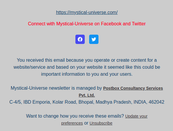
The last block of the content of an email template is an email footer. You can use email footers as email signatures. This is also a great way for making automated emails seem less robotic. Some other important information the email footer contains include
- Contact information
- Legal requirements
- Unsubscribe button
- Preference adjustment CTA
- Website link
- Shop Link
- Customer support
- Postal address
- Company logo

Top 7 Best Practices For Email Footer Design
Apart from enabling a business to comprise with the GDPR rules, email footers play a crucial role in forming the recipients’ impressions of newsletters. On that note, here are the top best practices for email footer design that can transform the way email marketing campaigns work. Let’s take a look.
1. Ask For Feedback
Asking for customer’s opinion is one of the best ways to make them feel that you care. Considering the sheer number of hours we take optimizing an email campaign, it makes sense to ask the recipients about their level of satisfaction with a campaign. A simple ‘thumbs up thumbs down’ or yes and no system doesn’t require much effort on the recipient’s part. This way they are likely to give their feedback most of the time. Star rating provides them a wider scenario to rate your email.
A creative way for asking recipients to rate your newsletter is the use of emojis or enticing stickers. You can add an option for commenting if the user wants to provide for the details. Collecting CTR open rates is sometimes not sufficient for determining whether the content is beneficial for your subscribers. On the other hand, a rating and review system gives you an exact idea of the performance of your campaign. You can later use it to evaluate the content and make improvements.
2. Show Your Gratitude and Appreciate The Recipients
Yes, we go through a great deal doing market research and bring relevant content and lucrative offers to to our subscribers. Should they thank us for the same? No. In fact, it’s the other way round. Their attention is something email marketers have to be grateful for. After all, the competitors are just a click away!
Only a handful of email marketers thank the readers to pick out time from their busy schedules to open and read the newsletter. Well, that’s unfortunate. How hard is it to wrap up the newsletter with a little thank you note?
3. Embed Customer Support Contact Information
It’s hard enough to catch their attention. But when an email sparks someone’s interest, it’s important to provide them easy means to reach out to you. Offering customer support information becomes all the more important when it comes to reporting complaints or requesting assistance.
You can include links to guides and tutorials as useful documentation. Customers should also have an option to get instant solutions to their problems through email, messaging, for calls. I have noticed many email marketing provide a link to the FAQ section at the footer which is a great problem solver!
4. Embed a Search Bar To Go The Extra Mile

Not all email marketing campaigns embed a search bar in their email footer. In a time where every other marketing tactic is becoming mainstream, it’s hard to come across unique measures to increase conversions. When you embed a search bar in your e-mail footer, you set yourself apart from millions of marketers out there.
If they can match your email quality and reach in other ways, here is a chance for you to go the extra mile. A search bar is a lesser used CTA button that encourages subscribers to search requests. You can also analyze what they are looking for and serve them better in your next set of emails.
Checkout How to Code Search Bars in Email
5. Offer Subscription Preferences
Subscription preferences are an important part of customer satisfaction as well as compliance. Customers should be able to manage their preferences and opt out of emails if they no longer want to receive them. The unsubscribe link is an easy way out. But it’s better that you provide a link to some kind of subscription management page. This helps them decide what kind of data they want to receive and what they don’t.
6. Style Your footer For Maximum Attention
The best way to draw attention to the footer of an email is to contrast it with the body of the email. For example, if you have a light background and dark text for or the body, reverse the color combination for the footer. Keeping simplicity in mind while designing footer is the key to a clutter-free interface.
Minimalistic layouts make the footer content easily accessible. E-Commerce stores can also consider adding a menu to the footer to enhance conversion rates. Another major attention grabber is displaying your history and awards. It helps build credibility. As a result, subscribers can trust you, thanks to your positive track records and accolades.
7. Add Social Media Icons and Forward Button

An integration between email marketing and social media is a proven tactic to increase sales. Therefore, add icons for Facebook, Twitter, YouTube, Instagram, Linked In, and so on in the footer. Make them catchy, bright, and colorful. This way, the subscribers can check out your social media pages as well as share your offering with their friends on their favorite social media platforms. Another great initiative for the email footer is to offer a forward button. While your subscribers already have the option to forward, nothing beats watch in front of the eye!
Final Words
It’s high time email marketers stop treating email footer design as an afterthought. While the disinterested audience might overlook the footer, clear cut converted users consider it as a place for clarity and transparency. It says a lot about the brand and is an important component of online reputation.
Last impressions matter as much as first impressions in the 21st century and beyond. Therefore, it’s time to stop being tangled entirely on the subject and body and start focusing on stuff that email marketers pay less attention to, like the email footer design.

Author : Veethee is a Computer Science Engineer by degree and a passionate writer by choice. The credit for her profession as a web content writer goes to the knack for writing combined with a technical background. She believes in utilizingher skills to spread awareness and simplify people’s lives with her writing! When she is not busy playing the game of words, she likes to indulge herself in hobbies like reading and hitting the gym.


