Best practices for designing an email newsletter template
Related article : Top 7 Best Practices for Email Footer Design
In this digital world, emails are one of the most efficient ways of marketing. But the question is how can we consume the advantages of email newsletter template in a better way? We will discuss all the email template best practices but before that let’s talk about the importance of email templates.
Designing email templates is the most creative way of mailing if your email deals in the advertisement, marketing and newsletters. Email templates save a lot of time while creating email marketing campaigns. It allows you to create a design easily by copying the HTML code and pasting it and the most attractive function is that you don’t need to start from scratch every time, you just need to edit links, images and content in your template as per the new email newsletter and you are ready to go. Using templates is one of the best practices that can be utilised in bulk mailing.
Using templates in your email is no big deal. There are several easy ways of doing it. You can design it by HTML skills or if you’re not into coding you can get pre-written HTML codes of templates on internet, other than this there are plenty of free and paid tools available from where you can select your suitable template and make your email creative rather than leaving it blank if you’re running email newsletters. Below are a few tips that should be kept in mind while designing a template of email newsletters for a better response:
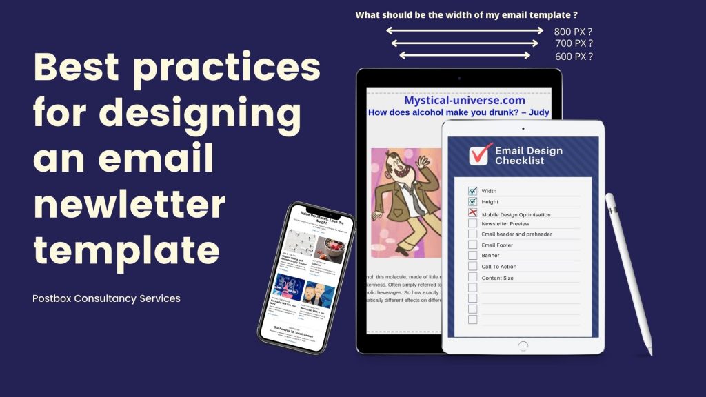
Size of the email newsletter
Size of the email newspaper template is the very first practice that should be kept perfectly to make your email clearly visible to the readers without getting broken and should not take too much time to get loaded and should fit the reader’s screen perfectly.
Width – Well all email template designers and email marketers would already beware of the ideal width of an email template i.e. 600 px. It is a traditional width of an email that has been used for a long time and still considered an ideal size as it perfectly fits on screens of almost all devices. Though it is not mandatory to keep the same width every time, you can even increase it, as in the technology getting updated day by day, the emails with higher width also started working perfectly in most of the devices. It is just preferred that if you’re keeping the email width more than 600 px just check it by running a test campaign on all the important email service providing platforms just to assure the quality and rendering speed of the mail before sending it to the real subscribers.
Though most of the email marketers have already reviewed that even if they keep the email width more than 600 px the email is getting rendered perfectly on almost all platforms but still it is advised to always cross-check before sending.

Height – Height of an email is not a concern as you can add as many rows as needed to explain your content clearly to the readers. The total height of the web page is 960 px and an ideal height on an email is 1600-2000 px but that’s not a problem as you can provide an easy scrolling to the readers in the matter of height.

Mobile device optimization:

The most important factor that is advised in almost all the email practices as almost all the email services are available on mobile phones nowadays and 50% of email users use it on mobile devices. The screen resolution differs and if you’ve designed your email as per the computer screen resolution, you would eventually fail to convert mobile readers into customers and your template would not be visible on the phone. The best solution for this is that if you think that your template would be too long for mobile devices, you can hide some elements on mobile.
Newsletter preview:
The preview of the email newsletter should contain the most value as compared to the entire content.
The reason behind this?

Actually, as we discussed above the main concept behind designing an email template is designing in such a way that is compatible with most of the devices and almost all the email clients. The same goes here, there are many email clients which have email preview windows. Generally, the size of this preview window is 600 px wide and 300px high. This much height just shows the preview of the email to the reader and if he doesn’t find enough value and information in the preview he may ignore the email even if it is valuable inside. That is why it is advised to put valuable content in the first 300-500 px of height so that the reader could find the email profitable and continue to read it.
Email header and preheader:

An email preheader is one of the email template elements that is placed on the top of the template and the email header. It occupies a small size of 50-60 px high and contains a short intro or an important notification or special offer that is being provided in the email. Pre-header is a small but useful element of an email. It is basically used because, suppose if your email is facing any rendering issues, at least your preheader would be visible to the reader and will explain that what the entire email is about so that the reader can get an advance idea about your content and you can attach the link of your web page in it so that he can click the pre-header and directly land on your web page.
The email header is something that cannot be assigned with a particular size, it is the first element of the template and should be designed as per your content or newsletter. Just keep in mind that it should be user friendly. Generally, the height of an email header is around 100-200 px. If you don’t include a menu bar or logo in it it can be kept small. Choose whatever suits the entire newsletter.

Email footer:

There are no mandatory limits to the height of the footer but is generally 200 px high. It is an important element of the email template and is also referred to as the email signature. That contains the details of the company like address, contact credentials etc. The width of the footer is as per the width of the screen device.
Banner:

An email banner in a template is something that is highly important and provides a higher conversion rate. It is simply a piece of creativity that expresses the intention of the mail and about the services and product you are providing. It is advised that a banner should not be kept limited to any particular size and should be designed as per the need but should shower the value and perks of your offer in a fascinating manner. So you don’t need to bound your banner in specific dimensions. Just remember, it should be attractive enough that makes the reader go through your site and don’t forget to place a clear call to action on your banner. Place the email banner just after the header.
Call to action:

There is no specific size decided for CTAs and other buttons in a template. It is just advised to keep the colour and shape of the buttons in such a manner that it is easily visible to the reader and he can easily go to the further page by clicking on it.
In this practise it is also important to keep different devices in mind. The size of the button should be optimum for computers as well as mobile users so that you don’t miss potential customers in any chance.
Content size:

We have discussed almost every element in an email template for a newsletter. Overall, there is no specific size to keep in mind for the entire content, something to be taken care of is that even if your content is long, the reader should be able to do easy scrolling and while putting images in it generally the images will automatically take over the size according to the email template but keep it in mind that it should not be huge compared to the whole content, every element should look alike and symmetry should match among every element of an email template to make it attractive and clean.
Closing remarks:
At conclusion, a perfect email template is something that is around 600 px wide, having an ideal height and should be easy scrolling, should be optimized for mobile phones, having a valuable and informative preview and should consist of correctly designed header and footer.

Palash Thalnerkar
Blogger/ Digital marketing associate
Hey there! I’m Palash, a digital marketer and a passionate blogger. I create contents and blogs on technical as well as non-technical topics. Apart from writing articles, I write blogs on digital marketing and email marketing tactics, problems and their solutions.
Thank you
Stay tuned!